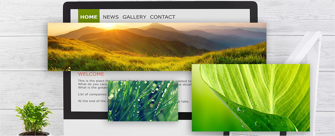
Much like the welcome mat at your front door, a Website’s Homepage is the welcome mat that leads to the world of your Business. Your Homepage is usually one of the very first things that people see when they first come to your Website, and when it comes to the Online World, first impressions matter. This makes it absolutely imperative that your Homepage is ticking all the right boxes when it comes to design, content and best representing your Business and brand message.
You could have the most innovative product in the world, but if you don’t get your visitor’s attention within the first few seconds of them landing on your Homepage, they’ll likely abandon your Site. In fact, according to research, if your Homepage doesn’t appeal to your visitors within roughly 8.5 seconds, they’re likely to jump straight over to your competitors Website. It sounds harsh, but that’s the brutal reality of the Online World, which is why absolutely nailing your Homepage and making a good first impression is paramount to your Small Business’s Success.
So, if you’re wondering how you can really maximize your chances of turning Website visitors into leads, keep on reading because we’re going to reveal the 5 most effective ways to make your Homepage convert.
1. Focus on One Call-To-Action
If a user lands on your Site and they’re unsure of the action you want them to perform, they’ll leave, no questions asked. Instead, what you want to do, is offer one completely clear Call-to-Action, which will help guide them, whether that be directing them to buy, make a booking or sign up.
Remember, people want to save time Online, they don’t want to be left hanging wondering what to do. By offering one clear Call-to-Action (CTA), you’re simplifying the whole process for them.
One of the best ways to do this is by offering them a single Call-to-Action button, which is repeated in multiple places on your Site. Examples of these might be “Buy Now!” or “Contact Us Today”. Don’t beat around the bush. Remove any content that isn’t directly related to what you want to happen, as this will avoid confusion and, ultimately, drive conversions.

2. Keep It Short and Sweet
This is true not only of your Homepage but for every page on your Website. You don’t want to waste your visitor’s time by creating an arduous block of text that isn’t necessary for them to read.
Being faced with a huge chunk of text is neither appealing nor engaging, so make sure you keep content short, sharp and sweet. Homepages with short copy have been proven to convert more effectively than those with larger bodies of text.
If you have a Business or product that requires more explanation, then perhaps consider moving this content to the About Us page or one of your Product Pages. You can even get creative with the content and use a video instead of written words, as video content is much more digestible than words, and is actually favored by mobile users.

3. Solve Your Customers’ Problems
One mistake that often trips up a lot of Business Owners is that of creating Homepage content that is overly “sales-ey”. Instead, try and focus your content on identifying your potential customers issues and position your Business and products as the solution to their problems.
People don’t like to be sold to. So make sure your Homepage content doesn’t only provide information about you. Yes, make sure you tell people about your Business, but also identify how your Business can directly help them, and can significantly improve their life in some way. Remember, the reason they’re on your Website is because they have a problem, and you need to tell them that you’re here to help solve it!
Not only will this allow your visitors to connect with you and view you as empathetic, but they will also feel as though you understand them and care about their specific needs. This is one of the very best ways in which to build rapport and trust with potential customers, which will likely lead to an increase in sales.

4. Create an Enticing Headline
Headlines are absolutely critical to the success of your Homepage, and should never be neglected. By using effective headlines, you can better segment your content to help users find what they’re looking for, and grab their attention straight away.
You only have one shot to attract people to your Business, so make sure your headlines are interesting, persuasive and relevant. Make the reader feel as though they need to keep reading the text below, otherwise they’ll miss something important!
Your goal is to keep visitors on your Website for as long as possible, as the longer they’re there, the more likely they are to convert. By using catchy, attention-grabbing headlines, you can get their attention early and have them reading your content like there’s no tomorrow!

5. Use Visuals That Stand Out
You’re probably familiar with the famous line, “to see is to believe”. This is also applicable to a Homepage. Nowadays, the Online World is positioned towards visuals, as this is what really captures peoples’ attention. So, if your Homepage simply displays lines and lines of text, you’re unlikely to stimulate excitement or engagement form your viewers.
This makes using great visuals, graphics or photos on your Homepage really important when it comes to driving sales Online, as they attract and maintain attention better than words do. They are also much easier for mobile users to digest on smaller screens, which will also help to aid in conversions.
Along with images, videos are also an effective tool in your Conversion process. People sometimes want to ditch the written text and simply watch a video that explains everything they want to know. Easy!
If you want better Conversion rates for your Website, start adding relevant graphics and video explainers that are of a high-quality, as this will serve to make your Business look professional and will increase your authority in the industry.
While it’s absolutely vital that you get your Homepage right in order to truly maximize your conversions, there’s no point in losing sleep over it. Simply follow the 5 tips above and you’ll have a firm understanding of exactly what you need to do to give yourself the very best chance of creating a killer Homepage, that won’t just look good, but will help drive sales.


