Your website might look amazing and be at the cutting edge of modern design, but is it actually usable?
The basic conventions of website usability relate to the ease and fluidity with which visitors are able to search and browse your site.
Basic usability means that users are able to meet their objectives speedily, and that information is easy to access. As its core, usability is about organising and planning design around the needs and ease of the user.
A great website is one that allows a first time visitor to feel at home as they browse through. Navigation is simple, effortless and completely organic, All your information is straight-forward and accessible, All your buttons do what is expected, and users can easily identify what information is where. No strange surprises, no fumbling, no frustration, no time-wasting.
But how to create this kind of user experience?
In web design, some fundamental conventions are pretty sacred. Breaking them amounts to messing around with the basic tenets of usability and thereby confusing, annoying or enraging prospective customers. While innovative design may seem appealing, it will be basically useless if visitors become disoriented or frustrated by unfamiliar elements, and ultimately abandon your website.
This doesn’t mean that you need a boring, generic website. Creativity is great when it’s not interfering with functionality. However, innovation shouldn’t get in the way of basic usability. Every element of your site should make sense and be easy to follow.
Here are ten simple usability rules.
1. Logo on the top left
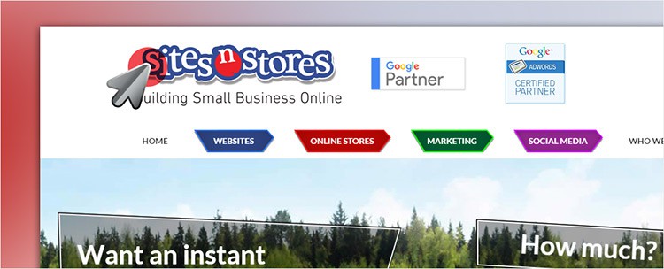
The proper place for a logo to be on your website is on the upper left of the page. This expectation is so deeply entrenched because it’s very rarely violated – and when it is, things tend to feel unfamiliar and strange, which is not actually a goal in web design.
When a user is browsing the internet with multiple windows or tabs open, or they’re browsing through various pages on your site, having the logo consistently in the top left subconsciously tells them exactly where they are. Putting your logo in an expected place helps keep all the different windows or tabs in order.
2. A clickable logo
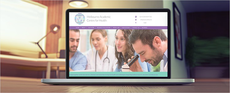
Sometimes web site visitors can go down the rabbit hole, and you need to provide an easy way to get back to your homepage. Your logo should be able to take your visitors back to their home page. This is especially important for information-heavy sites, or if the link to the homepage is not clearly and easily visible “above the fold” (i.e. the portions of your site that are visible without scrolling). By clicking on your logo, visitors should expect to be taken back to your home page.
3. Link styling
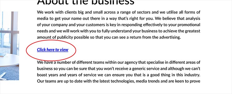
The rules around what is and isn’t a link have been ingrained in web users for a decade, and woe to any website that breaks the sacred rules.
Typically, a link appears as underlined text. Text in a different colour can also signify links and most regular blue is used here.
Ultimately, this means you shouldn’t underline words that aren’t links, as well as avoiding using differently coloured texts (especially blue) for non-links.
4. Clear navigation
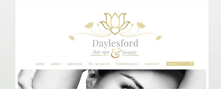
Intuitive navigation is crucial for ensuring visitors can find what they're looking for quickly and easily.
Ideally, a visitor should be able to arrive on your site and not have to think extensively about where they should click next - moving from point A to point B should be as pain-free and self-explanatory as possible.
When establishing the way your site’s navigation is laid out, bear the Three-Click Rule in mind.
The Three-Click Rule suggests that visitors to your site should never be more than three clicks away from what they are looking for. This is predicated on the view that visitors will become frustrated if they cannot find the information within three clicks, and will leave.
Although this rule, in its strictest sense, has been debunked as a myth, the principle is nonetheless apt. What it illustrates is the importance of concise navigation and clear site structure, which allows visitors to easily and intuitively locate information.
Some tips for optimising navigation on your site:
- Main navigation should appear in a bar across the top of your site.
- Keep the structure of your primary navigation simple.
- Include navigation in the footer of your site.
- Include a search box near the top of your site so visitors can search by key terms (more on this in a moment).
- Don't offer too many navigation options on a page.
- Don't dig too deep. In most cases, it’s best to keep your navigation to no more than three levels in depth.
- Keep it consistent. The labels and location of your navigation should remain the same on each and every page of your site.
5. Buttons should behave like buttons

Buttons are useful features to include in your web design because they are extremely intuitive.
But make sure that all buttons actually work, and link to where they’re meant to. A button that doesn’t go anywhere will confuse and infuriate visitors.
6. Keep icons standard
Conventional icons are especially important because of their ability to provide clear, self-explanatory signals without language.
For instance, an envelope icon immediately signifies emails, a shopping cart icon screams checkout, and social media icons are branded calls for social sharing. These associations are so commonplace that our recognition of them has become automatic.
Icons are only useful if they are so common that no additional explanation is required. Replacing a shopping cart icon with, say, that of a yawning dog might be cute, but it will likely confuse your users.
7. Visual hierarchy

Visual hierarchy is all about the way in which information is organised. It tells us which information is the most important, what to read first, and what comes next. It guides us in terms of direction and decision-making.
Basically, this involves arranging and organising elements of your website so that visitors naturally gravitate toward the most important elements first. It’s about prioritisation.
Again, we’re so accustomed to this convention that it’s become automatic. When websites deviate from this basic usability rule, it becomes confusing and disorienting. Sticking to a standard visual hierarchy on your site brings visitors back to this familiar, logical structure.
Visual hierarchy is also the difference between a website that strategically guides and influences users, and one that just looks good.
8. Clear naming
With so many businesses competing for attention online, making yours stand out and establishing a point of difference is vital. Creativity is essential to maintain an edge over your competitors and to establish your business as unique.
But don’t fall into the trap of using creativity to obscure information and confuse potential customers. Pun-filled, overly clever names can be fun, but your business name should still be informative. What your company does – the basic gist of the goods and services it offers – should be clear.
Simplicity is generally the best policy here.
9. Searchability

A search function is almost compulsory for larger sites, but regardless of your site’s size and complexity, it’s still good practice.
A search facility should also be straight-forward in terms of accessibility. The search box is usually labelled as such, and the associated button generally reads “Go”. If the box is not labelled, the button should read “Search”. Regardless, it’s vital to ensure that what the box does is obvious. Now is not the time to reinvent the wheel.
10. Mobile compatibility
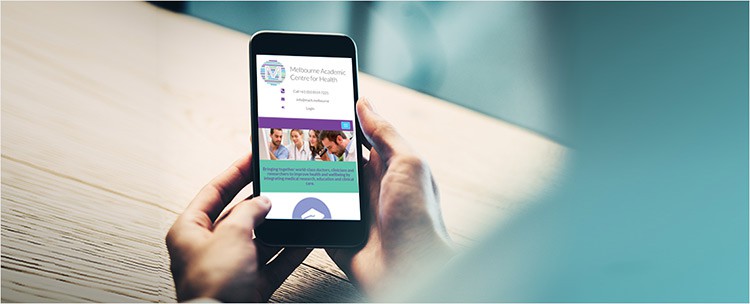
Smartphone browsing is increasingly pervasive, so it’s more important than ever to aim for a site that’s easily viewed on multiple devices.
Mobile optimisation can generate more traffic, increase sales, and boost customer engagement. It’ll also give you an edge over your competition.
There are a number of approaches to ensuring that your site is mobile-friendly.
The first of these is responsive design. This is geared towards crafting websites so that they provide an optimal viewing and interaction experience on any device, from desktop computers and laptops, to tablets and mobile phones.
Opting for a mobile site is another possibility. A mobile site is a copy of your website, where the server does the work to deliver an optimised page that’s smaller and easier to navigate.


Get posting!
If you need some help from a social media specialist, talk to one of our experts today – if you are a current client, call 1300 883 639 – call (213) 634-1668 if you are a new client.


