With smartphone browsing becoming increasingly commonplace, if not ubiquitous, it’s more important than ever to aim for your site to be mobile-compatible – or possibly even adaptable on multiple devices, from desktop computers and laptops, to smartphones and tablets.
There are two major approaches for a mobile-optimised website: getting a mobile site or opting for responsive design. But what are the differences between them? And which option is right for your website? Is one preferable to the other?
To make weighing up these options easier for you and to help you work out which is better suited to your website needs, we’ve outlined some elements that differentiate the two, and explore some pros and cons for each.
1. Mobile sites

Usually, a mobile site is created in addition to a desktop version, and is designed specifically for mobile devices. That is, you would actually have a completely separate site for mobile uses.
Here, content tends to be constrained, and is limited to only what is considered immediately important to the mobile user. Mobile sites also tend to avoid common desktop features that don’t translate to mobile, such as Flash.
With mobile sites, the visual design is clean, displaying minimal graphics. This results in a quick loading time and an easy-to-navigate, user-friendly interface. A mobile site should also provide a link to the full desktop version for visitors who want to zoom in and see every single element.
2. Pros

- Lets you craft a website experience to suit different users’ requirements.
- Quick loading time.
- A practical, economical choice if you don’t want to overhaul your current desktop site.
- Typically less expensive than responsive design.
- Shouldn’t necessarily be seen as a lesser alternative to responsive design – sometimes, depending on your particular website needs, objectives and budget, this just makes more sense.
3. Cons

- There are multiple versions of your site that need to be maintained and updated; there can also be syncing issues when new elements are added in.
- A simplified mobile experience may result in the loss of functionality and seriously disappoint users who expect the same access as the full site.
- Might become a little restrictive in the future due to the introduction of new technologies and devices.
4. Responsive design

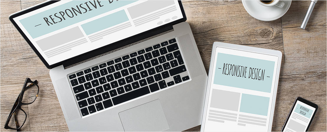
A responsive designed website is one which is designed to adapt the way it displays on a range of different devices including desktops, tablets and smartphones.
Instead of designing a unique version of your website that is only for mobile visitors (mobile website), the content on a responsive website will adjust itself under a set of programmed rules to fit the screen dimensions of your visitors’ browsing device. With responsive design, your website will adapt automatically to the size of the screen viewing it, whether that’s a mobile, tablet, laptop or desktop.
5. Pros

- Consistent user experience (and consistent brand experience) across devices.
- Same overall content will be displayed similarly regardless of the device a customer is using.
- Just one site required.
- There is only one set of code and it covers all platforms.
- Image size scales according to device.
- More streamlined and elegant.
- Is probably the future of the mobile web.
- Great for SEO – all of your sites pages will live on a single domain (ie. the “www” version). Google also recommends having a responsive design for your website and it’s always a good idea to listen to Google when building your website.
6. Cons

- Can limit the types of things you can do and features you can include on a website.
- It can be difficult to achieve “perfect” results on all platforms and between different sized mobile devices – there is often a considerable amount of trial and error involved.
- Large images and files which are perfectly suited for a desktop can slow down loading for mobile users.
- Not a simple add-on or patch. Updating your website to a mobile responsive design will almost always require a complete redesign. However, isn’t necessarily a bad thing, it provides you with the perfect excuse to give your website a new, cutting edge look.
- Typically more expensive.
- Doesn’t always meet business and user goals.
7. Which is right for me?

Are either of these options – mobile sites or responsive design – better? This is a rather complex (and sometimes polarising) question, and can be quite contentious in design/development circles.
Ultimately, the right choice for you and your business comes down to a range of factors, including budget requirements, timeline, target audience, and your business needs and objectives.
Responsive design is the more fluid, sophisticated option, and most likely represents the future of the mobile web. However, it’s not necessarily practical. It typically requires a complete user interface redesign.
Responsive design is ideal if you are starting a whole new site from scratch. If you would like to update your branding or reinvigorate your business’s image, this would definitely be a reason to do so. But if you’re happy with your current website and you really just want to create a mobile friendly version – or don’t have to budget to redesign it – it may be more cost effective to opt for the creation of a mobile site.


