When it comes to designing a great Website, getting it right might be harder than you initially think. It’s easy to get hung up on the colors, what font to use, the size of the logo or the alignment of the text, but when it comes to great Website Design, aesthetics aren’t always the most important aspect. If you’re really trying to achieve Small Business Success Online, you need to look deeper and focus on more than just how your Website looks.
Have you ever stumbled across a fantastic looking Website with great visuals but you find yourself lost, with no idea how to navigate your way around? On the surface the Website is amazing, but underneath all that prettiness the functionality is lacking. It’s all well and good to have an eye-catching layout, but when your customers can’t make their way around your site then there’s a problem.
To really achieve great Website Design you need to optimize your Site to focus on both Visuals and Functionality. But how? Well, it all comes down to usability or what’s more commonly known as the “User Experience”. This is a combination of structure, colors, content, great navigation and technical components that all work together to produce an overall enjoyable Website experience for your visitors.
To help you out on your journey to achieving great Website Design, we’ve put together these 4 simple tips you can use to help you achieve truly great Website Design for your Small Business.

Simplicity
Having 10 different colors on your Website might be your idea of great design, but trust us, most visitors will turn away within seconds if your Site is too busy or complicated. Remember: simplicity is key when it comes to great Online design.
Your visitors are landing on your Website to find specific information or to complete a very specific action, and if they can’t see how to achieve this straight away they’ll simply jump over to a competitors’ Site.
By adding unnecessary design elements, especially ones that serve little to no purpose to the functionality of your Site, you’ll simply be hindering, rather than helping, your visitors.
No matter what Product or Service you’re selling, simplicity is key. This can be done a number of ways, such as:
- Limiting the amount of colors you use
- Using legible and limited typefaces
- Only using graphics where necessary
- Keeping text short, sweet and to the point
- Don’t be afraid to include white space in your Website’s design. Remember, not every inch of your Homepage needs to be covered!

Navigability
Bit of a tongue twister but essentially this means having seamless navigation throughout your Site. While this is something that seems quite obvious, it’s unfortunately not always implemented across Sites all too effectively.
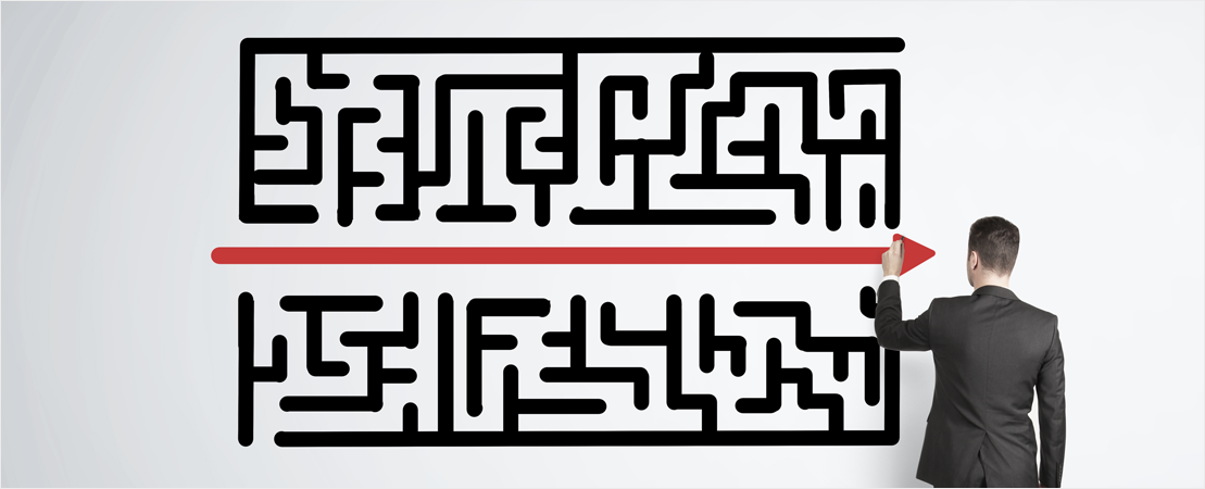
You should think of your Website’s navigation as the roadmap you give your potential customers, allowing them to easily work their way quickly through your Site to carry out their (and your!) desired action. In this way, the better your navigation, the more likely you are to convert your Site visitors.
These days, people searching Online don’t have the time to be stumbling through confusing Websites, waiting for multiple pages to load or dealing with a million Call-to-Action buttons that lead to completely random pages. Offer them this, and they’ll likely give up and bounce right off your page within seconds.
To ensure that your navigation allows customers to easily make their way around your Site without hiccups, there are certain best practices you should implement. These include:
- Creating a standard primary Navigation bar: A clear and obvious menu at the top of each of your pages will help your customers go back and forth throughout your Site with ease
- Adding a Search bar: If your customers know exactly what they want to find, make it even faster for them by giving them access to search functionality
- Adding a Site Map: At the footer of your Website include a clear and detailed Site Map showing customers exactly how to navigate throughout your Site.
- Keep it consistent: Once you’ve nailed the navigation on your Site, remember to keep it uniform across all pages

Consistency
And speaking of consistency… in order to really pull off great Website Design, the overall look and feel of your Site needs to be the same across all pages. This means using the same backgrounds, colors and fonts from your Homepage to your Contact Us page and everything that’s in between.
Not only will this aid in the overall branding of your Business, but it will just visually make sense to the viewer. If your Site looks different from every angle, they’ll wonder if they’re even on the right Website! By maintaining a similar look and feel to each page you’ll be giving yourself the biggest chance of making the best impression.
But that’s not to say that each page has to look completely identical. You don’t have to stick to the same exact layout for every single one of your Website’s page. In fact, we suggest that you don’t. But by sharing a coherent theme across your landing pages, your customers will find it easier to understand you as a Business.

Organisation
Much like a messy room, having a disorganised Website can be a total turn off. If you’ve got a pile of clothes shoved in the corner of your room, this creates clutter. This is the same for Websites. If all your images, videos and written content are bunched all together, or spread miles apart, it will create chaos. And customers avoid chaos like the plague. This is why having a well-organised and structured Website is extremely important to maximise your users’ experience.
Arranging your content in a well-structured and clearly arranged way won’t just make your Site easier for visitors to navigate but can also work to your advantage as a Business Owner. By placing certain components of your Site in the correct place, you can lead visitors to naturally gravitate towards the most important elements first. This means you can make things such as Call-to-Action buttons stand out more and position them in such a way that clicking it seems to be the next most natural and obvious step for the user.
Furthermore, you should put your best information in your headings and subheading to really get your messages across in a short amount of time.
We all want a beautifully designed Website, but as you can see above, the key is to achieve a Site that is both aesthetically appealing and functional. Achieve both and you’ll be welcoming potential customers to your Site by the bucket-load! Remember the 4 major components that you should include on your Site to improve the user experience, and you’ll be one step closer to having truly great Website Design.


