Well, there goes another year! All of a sudden Christmas has come and gone, and I swear New Year’s Eve 2016 was just last week? 2017 has most likely seen you face many challenges, successes and everything in between as a Small Business Owner. You’ve no doubt been faced with new Business developments, and are maybe even now beginning to dabble in the world of Digital Marketing.
With every New Year, there are new trends in Website Design that come and go. 2017 was all about GIF’s and animations, minimalistic design, a new generation of responsive Websites, and was a year packed with Digital Marketing and Website integrations.
Yes indeedy, is was a massive year for the Small Business Owners, and if you started your Online journey in 2017, hold tight, because there’s so much more to come in 2018!
So just what are you in for, and how can you ensure you have the very best Website possible for the coming year? Well, looking towards 2018, we’ll still likely have a desire for mobile responsive Sites and we’re still not yet over our fascination for the moving image. After all, who can say no to a bit of skilled animation!
But for the coming year, there are a few new elements to consider implementing for you own Website, if you really want to maximize your chances of Small Business Success. Keep reading to ensure you have the best Website for 2018!
ChatBots
You may have noticed that Websites are increasingly integrating new plugins and applications into their backend, allowing for more advanced functionality that really elevates the user-experience.
This has seen a phenomenal rise in the use of artificial intelligence for Websites, more commonly known as ChatBots. These little bots are knowledgeable and conversational chat systems that are integrated into Website to assist Site visitors and build rapport with your customers.
They could be programmed to answer questions, prompt a message or suggestion based on Website activity, or simply be there for when your users need support. If you’re looking to increase engagement, personalise your Brand and increase your likability as a Business, then you should definitely consider implementing a little bot for your own Website.

You might think that this is old news. Facebook has been around for years now, how will it help me in 2018? Well, keep reading, because there has been a major shift in how you can utilize this Social Media Platform to grow your Small Business in ways you never thought possible.
The capabilities and audience reach of Facebook are becoming extremely valuable. It’s quickly grown into a destination for content and, in many cases, customers often discover your Facebook Page before your Website. This makes it essential that you not only have a presence on Facebook, but have a Facebook Page that’s regularly updated, engaging and linked to your Website.
Facebook can often now be the start of your customer’s sales journey, so it needs to be optimized as the best reflection of your Business and work hard to sell your Business to your potential customers.

Big, Bold Fonts
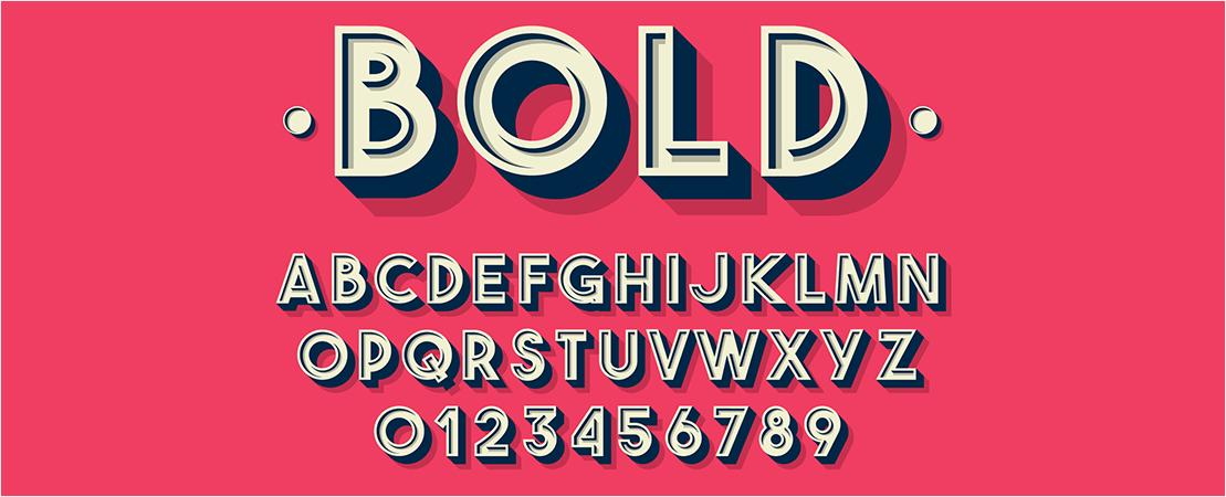
To complement all the modern design trends of the past year, 2018 is all about typography that stands out. This doesn’t mean content that’s text heavy, but instead means choosing bold font styles that catch the eye of your customers.
Consumer’s attention spans are becoming increasingly shorter, in an age where multiple screen, devices and technologies are all beeping and vibrating for our attention. Therefore, to really lure them in, use a Homepage heading that is large, vibrant and easy to read. This type of styling establishes your Business as dominant, in control and positions yourself as an industry leader with authority. Furthermore, if the heading is eye-catching enough, it’ll likely stay in the minds of your Site visitors for longer!

Clickable Phone Numbers
To ensure your Site is as optimized as possible for your customers, you want to make sure they have everything they need quickly and easily – and this includes being able to contact you with just one click…or screen tap.
Consumers are quickly growing impatient when it comes to Websites, especially on their mobile devices. If they have a query and need to call you right away, they’re not going to be bothered to copy and paste the phone number. They need to be able to touch your contact details and hit call within seconds. Adding this feature to your Site or Stores means you’re not losing any potential leads.
Sticky Elements
Similar to reading a book left to right, we look at Websites from top to bottom. But with the rise in accessing Websites through Mobile Devices, Online users can skip and move to half way down the page in just one swipe.
One way to avoid your important header content getting ignored is by making your header ‘sticky’. This means that no matter how far people scroll down, your contact details or search bar will still be present. And this doesn’t just work for header content. You can make images, logos or phone numbers sticky too ensuring all your important info is visible.
2018 is all about powerful Websites; Sites and Stores that are functional, technology driven and optimized for every kind of user experience. So, is your Website ready for 2018?
The hard truth is that an outdated Website can’t compete in the Digital World any longer, so if yours is looking a little cluttered or lacklustre, then take some of the above elements into consideration for your Website.
If your Website needs a facelift, here at Sites n Stores we’re constantly developing, updating and improving Websites for Small Business Owners, giving them the best possible chance of achieving Online success. So if your Website is out of date, give us a call to see how we can help you get the best Website for 2018.


