There’s no question that the right visuals can help you stand out from the millions of other businesses online. A carefully selected image can captivate your audience, strengthen your branding and even elicit specific emotions from your viewer.
Such is the power of images. In fact, the human brain processes visuals 60,000 times faster than text. Furthermore, 40% of people will respond better to visual information rather than plain text. This makes leveraging the best images for your website a smart move for every Small Business Owner.
Just as a great image can maximize your site’s performance and persuade your audience, a poorly chosen image can serve to confuse, bore or alienate them.
So, just how do you select the best and most effective images for your businesses website?
We’ve put together a list of tips on how you can choose images that excite, entertain and delight your potential customers.

Think About your Brand and Message
Before you even think about pulling out your camera or perusing the internet for images, ask yourself the following questions: “What is the message I want this image to convey?”, and “Will the image fit with my businesses brand?”.
This is a crucial starting point when it comes to selecting the very best images to relay your message and elicit the desired emotional response from your potential customer.
By providing your site visitors with an image that is clearly linked to your message and brand, you’ll create a sense of harmony and consistency that will dramatically increase the chances of your visitors carrying out the desired action. This could be anything from clicking a blog link to reading a product description.
By the same token, an image that seems random or lazy has the opposite effect. While it may be tempting to choose the first stock photo that catches your eye, if the image does not fit in with your businesses message or brand, you’ll simply confuse your audience.

Consider Color
When it comes to choosing the best images for your website, every detail counts. This makes considering the perfect color palette vital when selecting the best visuals for your business.
You’ll find that every color has a physiological association and can be cleverly leveraged to evoke the desired emotions from your audience.
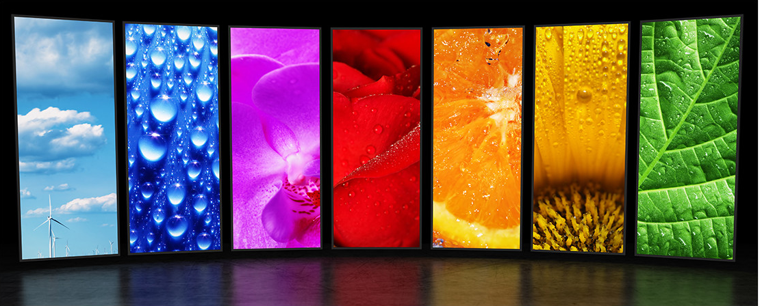
Colors such as red, orange and yellow are ‘warm colors’ and are considered to be inviting, fun, and energetic. So if you have an ad that needs to convey happiness or enthusiasm, incorporate these tones into your visuals.
‘Cool colors’, such as blues and greens, connote calmness and trust, which is why they’re often used by banks and financial companies. If you’d like to create a sense of peace or harmony, try utilizing these cooler colors within images.

Engage but Don’t Overpower
Images do indeed have a powerful impact, but this doesn’t necessarily mean your Homepage should be full of overly complicated and busy pictures, which can make them difficult to consume.
Selecting the best images means finding the perfect balance between choosing something that’s interesting and eye-catching, but not overbearing. Your visuals should complement your website’s text and layout in order to create a cohesive ‘whole’ that best captures the overarching message of your business.
If you select tricky, perplexing or puzzling images, they will likely overpower your website copy and detract from your entire website as a whole.

Be Authentic
While there is indeed a time and a place for stock images, they should be chosen and used with care.
If you choose to use cheesy, unoriginal images every time you require a photograph,you run the risk of reducing the credibility and trustworthiness of your business, because they feel so fake and staged. It can also significantly damage your branding, making you appear unoriginal.
Alternatively, well shot, real photographs of your business, employees or products evoke a much more natural, comfortable atmosphere. It can serve to make your website feel warm and inviting, as though you’re letting customers into your world.
This will not only help to grow customer relationships, but will increase their trust in you andstrengthen your brand. So, before you immediately jump to stock images, ask yourself if you could create something original yourself that could serve your business much more effectively.

Quality, Not Quantity
Yes, an image is indeed worth a thousand words, but that doesn’t mean you should put a thousand images on your website. When it comes to using pictures to your advantage, remember the golden rule: quality over quantity.
Sure, you may have a huge collection of photos you took yourself, but this doesn’t necessarily mean they have a place on your site. Using too many images will likely overwhelm your potential customers, making them disengage completely from the message you’re trying to send.
And don’t ever think about using photos or graphics that aren’t of a good quality. Blurry, over-exposed or under-exposed images will simply make you look unprofessional and damage your reputation as an authority in your field.
Instead, look at each image with the eye of an art critic. Make sure it’s of the best quality, a high resolution and sized correctly. A few beautiful images will have a much greater and more positive impact than a large number of average, low-quality ones.

Be Creative
With so many Small Business websites out there, the correct visuals can be a great way to help you stand out from the crowd. Choose images that are eye-catching, bold, beautiful or have a point of difference, as this will help set you apart from the competition.
Do some research into the kinds of visuals your competitors are using on their own websites and make sure you do something different. This could mean taking your own photos, using a brighter color palette, or even creating a collage from multiple images.
Whatever it is, pictures are a great way to distinguish yourself from others within your industry.

Seek Professional Help
Creating a beautiful website with carefully selected images that will really maximize your online presence is both a science and an art. And while taking all the previous points into consideration will certainly be helpful, it can really pay to enlist some professional assistance.
Professional Web Developers and Graphic Designers are pros when it comes to choosing and creating visuals that best reflect your business and brand. For example, here at Sites n Stores, our team are especially experienced in dealing with Small Business Owners, so know exactly how best to represent your unique business online.
By now you should have an idea of just how important images are when it comes to influencing your audience, strengthening your brand and conveying your message. Hopefully, now that you’re armed with our helpful pointers, you’ll be better equipped at choosing the best images for your website to truly maximize your success!


