In this age of digital saturation, any business that wants to be competitive needs a professional website. It’s no longer an option if you want to grow your business and create an edge. It’s a given for any business, big or small.
The stakes are high: everyone is already online, and today’s digital climate is one of instant gratification and constant connectivity. As a small business owner, your time and funds are also limited, and creating a website is time-intensive work.
So, where to even begin? Everything that needs to be taken into consideration can start to look overwhelming and intimidating.
We’ve made that process easier for you. We’ve compiled a comprehensive list of web design essentials that span the alphabet.

A is for Action
When it comes to converting leads into customers, placing compelling and specific calls to action on your website is essential.
In marketing, a call to action is the part of your advertisement that tells your potential customer exactly what you want them to do, inciting them to take action by making a purchase or engaging your services. The simplest example of a call to action is "Buy now!"
Your calls to action should be in highly visible locations. Ideally, they should also be included on every page of your site.
A compelling call to action is directional, extremely specific, and provokes an immediate response. The more information you can provide with your call to action, the more effective it will be. A call to action doesn’t need to be flashy or complicated, but it should be very clear.
Consider hiring a professional copywriter to craft directional, effective calls to action for your website. We’ll look more at the importance of sharp website copy in a moment.
B is for Blog
Adding a blog to your site can be a great way of consistently providing fresh, relevant, original content.
This can be valuable in a number of different ways:
- It can drive traffic and improve your rankings on Google.
- It can serve as the “voice” of your brand.
- It can help position you as an authoritative expert in your particular industry.
- It can provide a way for your customers to interact with you.
- It can be a highly effective marketing tool.
There’s also no better way to construct an edge over your competitors and develop the authenticity of your brand than by establishing yourself as the go-to person (or people) for any issues related to your industry.
A blog is a great way to start doing this. And there are a lot of different forms effective blogging can take: post genuinely valuable, interesting, informative content; help customers resolve their issues; offer new ideas and provide solutions.

C is for CMS
A Content Management System (CMS) is used to manage website content, and is essential if you’ll be updating or changing the material on your site post-design.
A CMS allows for simple, stress-free self-management and maintenance, making it easy for you to edit, modify and update the website yourself after it has been built – to edit, add and deleted images, for example, as well as many other functions.
Well-known CMS platforms include >WordPress, Joomla and Squarespace.
Your web developer should ensure that your CMS website is designed for updates and friendly, easy usage.
This means that your web design and layout will be structured to maintain visual appearance and functionality, and that you will be able to modify many different parts of it yourself without needing any specialist knowledge or technical expertise.

D is for Demographic
When designing your website – and embarking upon anything digital marketing-related – knowing your target market is absolutely essential. This will determine the overall look and feel of your site, the “voice” of your copy, the way in which your products or services are framed – everything.
Identifying and defining your target customer will help identify how you should be addressing and approaching them, and how you can catch their eye.
It is incredibly valuable to take the time to sketch out what you know about this hypothetic person. Give some thought to their lifestyle, habits, preferences, desires and needs.
Some things to consider:
- Are you targeting a particular gender?
- Are you looking at a particular age range?
- What is their budget like?
- What are their consumption habits like?
- How do they usually get information about products and services?
- What platforms do they use?
- What devices do they use?
- What do they read?
- Where do they hang out online?
- What is important to this person? What are their values?
- What problems can you identify in their lives for which you can provide a solution?
- What kind of tone would appeal to them? How would they best like to be addressed/approached?

E is for Easy Access
Accessibility relates to how easy your website is to navigate, use and make sense of. Broadly speaking, it relates to the friendliness of the user experience your site provides.
It is imperative that your website can be viewed optimally from a range of different platforms and devices (ie. not just desktop computers and laptops, but also phones and tablets – see more below on responsive design), as well as an array of search engines and referral sites.
Some things to consider when assessing how accessible your site is:
- Is there concise, logical navigation and a clear site structure which makes it easy for visitors to find their way around?
- How long does it take for visitors to find the right information?
- Is it quick and easy for visitors to achieve their goals/objectives?
- If you have an online store or a website with a shopping feature, is checkout simple? Does it contain minimal steps?
- Is the layout intuitive? How much thought is required to work out where to go and what to do (the answer should be “Very little” or “It’s self-explanatory”)?
- Is simplicity an underpinning principle when it comes to the architecture of your site?
- Are your contact details up to date and visible?
- How does your site look on a range of different devices? What kind of mobile experience does it provide?
Web accessibility also refers to the inclusive practice of making your site usable and accessible to people with disabilities by removing barriers that prevent interaction with them.
Accessible web design therefore aims to design and develop websites for all users, regardless of ability or the way in which they use the internet, and is concerned with providing all users equal access to information and functionality.

F is for Font
Like all elements of your design, the style of typography you use on your website should be simple and accessible.
Fonts are about usability, and should inform your website’s ability to provide a smooth, pleasant user experience.
Text should be easier to read, visually appealing, and not headache-inducing. Some things to bear in mind:
- Don’t use too many. The more fonts you have on a page, the more cluttered it looks. Pick no more than two.
- Be wary of fancy fonts. What may look beautiful to you might be difficult for your prospective customer to read. Ensure that the fonts you’re using are clear and accessible.
- Also ensure that they’re big enough to be read with ease.
- Avoid using low contrast fonts. This refers to a lighter font on a light background or a darker font on a dark background. Again, this is about usability.
- When choosing font type(s), consider the style and character of your brand, ensure that it’s consistently applied across all elements of design. How appropriate is the font you’ve chosen in terms of your brand identity?
G is for Google
Different digital marketing tools like SEO (“Search Engine Optimisation”) and PPC (“Pay Per Click”), which we’ll talk about more in a moment, fall under the purview of what is sometimes called SEM (“Search Engine Marketing”).
As its name suggests, SEM is a digital marketing category associated with the researching, submitting and positioning of websites within search engines like Google to achieve maximum visibility and increase your share of traffic (both paid and organic).
SEM techniques like PPC and SEO are crucial for ensuring that your website will be seen by prospective customers.
H is for Homepage
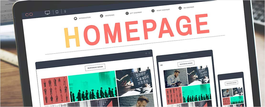
First impressions are everything. Your homepage is typically the first thing visitors will see upon visiting your site, and will have the most impact.
Serving as your business’s virtual front door, your homepage is generally responsible for drawing in the majority of your site's traffic, so it needs to pack a punch.
Some essential things that should be on your homepage:
- An eye-catching, snappy headline.
- Contact details.
- Engaging visuals.
- Your value proposition (the core benefit you offer to your customers).
- Your business logo.
- Intuitive navigation.
- Compelling calls to action.
- Social media buttons/links.

I is for Interactivity
Incorporating elements of interactivity onto your website is crucial for making your customers feel comfortable and engaged.
However, this doesn’t need to be showy or blatant. Whether it’s achieved through audio or video media, sliding interactions, or even scroll events, what is key about website interactivity is that it creates another layer of user engagement and movement.
There are many elements that can be focused upon to achieve web interactivity that attracts users. The main topic or focus of the website (ie. what your business actually does) should be taken into consideration. This should give a clue as to the kind of interaction to be used.
For example, a website that’s all about a particular product or products will have various categories on display. Instead of presenting products in plain rows, the range could be presented in an interactive way – for example, in the form of a three-dimensional flip book, or via an add-on like a lightbox with magic zoom.

J is for JavaScript
When designing your website, JavaScript is something to be extremely wary of.
JavaScript is riddled with issues. It causes major issues for mobile use, it’s notoriously insecure, and one coding error can potentially break your website. It can also slow down your website significantly, driving away visitors.
Where you can, use it judiciously.

K is for Keywords
Keywords relate to particular techniques and devices used by two major digital marketing tools: SEO and PPC.
SEO is one of the most effective ways of driving traffic to your site. Basically, SEO refers to the methods you can use to increase your site’s visibility and to improve its organic ranking on search engines like Google, Bing and Yahoo.
Google highly ranks pages it considers authoritative and relevant, and it measures this in a number of different ways, including the use of particular words and phrases, analysis of the quantity and quality of links to your site from other webpages, the quality of your content, and the user experience your site provides.
PPC, also known as Google AdWords, is one of the most directional forms of digital marketing. Like SEO, PPC is used in order to direct traffic to websites. It works by letting advertisers pay a fee every time one of their ads is clicked. Effectively, it’s a way of purchasing visits to your site, rather than attempting to “earn” those visit organically.
In both instances, keywords are vital for a successful marketing campaign. A keyword is word or phrase that your potential customer types into a search engine like Google to find a service or product.
For example, if you are a florist, a relevant keyword could be “Buy red roses” or “Looking to purchase roses from a flower shop”.

L is for Logo
Logos are vital in the creation of a brand identity for a business. They work to inspire trust and recognition, and to make your business stand out as unique.
Essentially, your company logo is your business’s face to the world. It’s one of the very first things that prospective customers will see when they visit your website or look at your product packaging.
An effective logo should encompass the service, product, message and image of your business. It should connect your website to all your marketing and promotional materials.
Some things to bear in mind when designing your business’s logo:
- An effective logo should be memorable and timeless, leaving a lasting impression in people’s minds.
- It also needs to be enduring, so it should be able to convey the message of your business for years.
- A good logo should be simple and uncluttered, conveying the message of your brand should with a cursory glance and making for easy recognition.
- A logo needs to reflect your business and speak to your target audience, so consider the appropriateness of the design.
- A logo should be versatile. Effective logos are able to work on multiple digital and print platforms.

M is for Management
Although a well-designed website shouldn’t be difficult to maintain after it has been created – if, that is, it has been built with user-friendliness in mind; this is why having it built on a CMS is so important – website design and management are time-consuming processes.
This is one of the reasons why hiring someone to design the site for you is highly recommended. Ensure that you are able to invest an adequate amount of time in upkeep.
It also pays to practice a healthy amount of vigilance by regularly monitoring your website. If your site is down, it might as well be invisible. All websites run into trouble every now and then, but it pays to be on the lookout for any potential issues – the sooner you spot one, the sooner you can fix it.
N is for No Nonsense
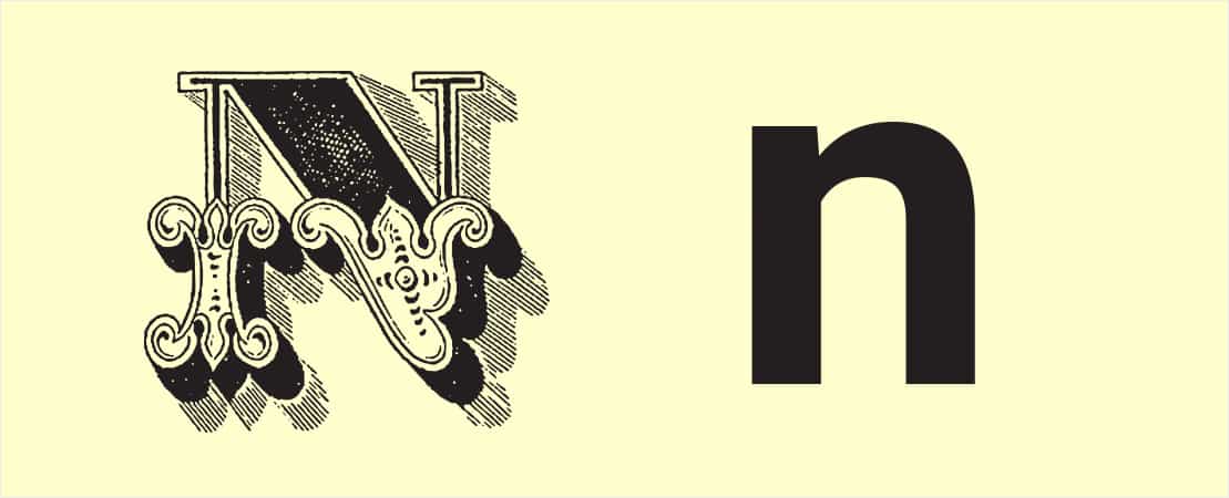
When it comes to web design, simplicity is key just about every respect.
Simple web design means clear navigation, no clutter, clean-looking fonts, sharp logos, and effective, BS-free copywriting that uses as few words as possible. This is not the place for embellishment.

O is for Open-Source
It’s vital that your website is built with open-source software, not proprietary, to allow for maximum freedom, control and flexibility.
Basically, open-source software utilises a source code that is available for modification or enhancement by anyone.
This means that in a worst case scenario – in the instance, for example, that you’re dealing with a suboptimal web designer and want to take your business elsewhere – you can move to another provider who will know how to program the site. Proprietary software, on the other hand, would mean that no-one else would be able to work on the site, thereby locking you in.

P is for Pictures
It’s an overused phrase, but a picture is worth a thousand words, and when it comes to capturing your audience’s attention, you want to take full advantage of every chance to communicate your message.
The importance of using images wherever you can on your website is a no-brainer. Images are able to tap into and evoke powerful emotions, and are integral in telling the story of your brand and conveying your business’s message. They are also vital for creating the feelings and aesthetic you want customers to associate with your business.
If you’re still in doubt, here are some very compelling stats:
- 65% of the population are visual learners.
- 90% of information transmitted to the brain is visual, and the brain processes visuals 60,000 times faster than text.
- 40% of people will respond better to visual information than plain text.
- When people hear information, they're likely to remember only 10% of that information three days later. However, if a relevant image is paired with that same information, people retain 65% of the information three days later.
- 65% of senior marketing executives surveyed believe that visual assets (photos, video, illustrations and infographics) are core to how their brand story is communicated.
- Content with images gets 94% more total views than that without.
- 1% of people say a website's design is the number one criterion for discerning the credibility of the company.
All this being said, make sure that the images you use are high-quality, optimised, and correctly formatted.

Q is for Quick
Digital culture is all about lightning-fast instant gratification.
Chances are, visitors to your website are going to want information fast, and are not going to be prepared to patiently wait for it. No-one wants to sit around waiting for a website to load, no matter how spectacular the products or services available once loading actually finishes.
We’ve all been to a painfully slow website, and let’s face it: it’s excruciating.
A considerable number of factors can contribute in slowing down your website speed. Some of these are:
- A site that’s not compatible for mobile users.
- Flash and Java.
- Excessive usage of advertisements.
- Unoptimised images.
- Broken links.
- Bloated code.
- An unreliable web host.
- Not using browser caching.

R is for Responsive
In a smartphone-transitioning world, it’s absolutely vital to ensure that your website is adaptable on multiple devices.
Research indicates that more and more website traffic comes from mobile users. 80% of internet users use smartphones, and over 20% of Google searches are now performed on a mobile device. This is very likely to become more pervasive still.
Responsive design aims at crafting websites to provide an optimal viewing and interaction experience on any device, from desktop computers and laptops, to tablets and mobile phones.
This means that the same overall content will be displayed similarly, regardless of the device a customer is using. It’s also recommended by Google, making for SEO best practice.

S is for Specialist
Sure, you can design your website yourself using a pre-made generic template. Sure, you can hire your brother’s partner’s neighbour’s friend to do it for you at special bargain basement rates.
But it will probably be totally unequipped to stand out in a hyper-saturated digital market. It will also most likely be limited in terms of functionality, and a nightmare to maintain and manage. It will also suck up hours and hours of the time you need to be spending actually running your business.
Businesses that do not have a professionally created website run the risk losing potential customers. Prospective customers are evaluating products/services and businesses themselves long before they decide to make an actual purchase, and if your website doesn’t seem professional or trustworthy, they will simply move on to the next one – probably that of your direct competitor.
With a site that’s created by an experienced web design agency, you get:
- A site that’s customised to suit your business needs, industry and audience.
- A site that stands out as unique.
- A site that can be easily found by the search engines and by the right customers.
- A site that’s specifically designed to be easy to navigate, user-friendly, intuitive and eye-catching.
- Ongoing support in case something goes wrong.

T is for Trust
These days, many businesses and services exist entirely online. In cases like these, a prospective customer will have had no prior, real-world experience to assist them in making that decision to trust a particular brand.
A website will be the sole point of contact, the primary source of information available to determine whether the business is worthy of trust. Even if a real-world presence exists, it’s very likely that a website is still the first experience a potential customer will have with the brand. It’s therefore easy to see how important web design is in relation to trust.
In keeping with this, the Stanford Web Credibility Project found that nearly half of all consumers in the study assessed the credibility of sites based in part on the appeal of the overall visual design of a website, including factors like typography, font size, colourisation and layout.

U is for Unique
In a competitive market, it’s absolutely imperative for your website to be unique. Your website should establish your point of difference – that is, that which separates you from your competitors.
One of the most important ways of ensuring that your website stands out and provides you with an edge over your competitors is to avoid pre-made generic templates and opt for customisation instead.
Getting a templated website may be a less expensive option, but will ultimately not work in your favour. Your website should be tailored to your particular needs as a business – there is no “one size fits all” in web design that achieves outstanding results.
Your site should be memorable and attention-grabbing – generic isn’t going to cut it. There are multiple reasons why custom design is far preferable – to name only a couple, your website will reflect the individuality of your business, and it will be designed to be SEO-friendly.

V is for Visual Hierarchy
When it comes to web design, visual hierarchy provides us with an organisational logic for reading. It lets us know what to read first, which information is the most essential, and what comes next. Visual hierarchy involves arranging and organising website elements so that visitors gravitate towards the most important elements first.
This is a convention so pervasively used in a web design that it’s considered sacrosanct. As such, it’s so deeply entrenched in our experience of websites that we automatically expect it. We’re so accustomed to this convention that it’s become second nature. We see visual hierarchies everywhere: newspapers, billboards, restaurant menus, utility bills.
Sticking to a standard visual hierarchy on your site brings visitors back to this familiar, logical structure.
You might think that subverting this will make your website quirky – it’s about being creative, right? Not so much. Doing away with this hierarchy will result not in an edgy website layout so much as a confused visitor who wants to leave.

W is for Writing
A great website can rapidly become an unprofessional-looking one if it’s filled with clumsily worded content and grammatically unsound copy. In order to attract customers, your copy should be compelling and professional, and needs to showcase both your product and brand itself.
Unless you are a wordsmith – and, ideally, have a background in content marketing – writing your own copy can be a bad idea. Typos, spelling or grammar mistakes, and awkward turns of phrase can make an otherwise polished-looking website seem amateurish.
Give some consideration to engaging the services of a professional copywriter. They will be able to highlight the benefits of your products and services, craft copy to effectively convey the message and “voice” of your brand, and engage your reader.
A pro will also be able to create specifically SEO-targeted copy so that your website will be findable on search engines like Google, and by the right customers.

X is X-Factor
In the digital marketing world, a phrase that gets thrown around a lot is “cut through”. As in, your website needs to cut through the noise. Your business’s ability to cut through is your point of difference.
When it comes to web design and the imperative to stand out, there are a number of ways in which you need to be able to cut through. And because the digital world is full of noise – a lot of it loud but irrelevant – this is tougher than ever.
Firstly, in a world of uninspiring, poorly crafted content, your website copy and headlines need to invoke your visitor’s interest and guide them to take action.
We’ve already talked a bit about calls to action, but it’s worth stressing just how important attention-grabbing, razor-sharp copy actually is. You need to be able to tell a compelling story that ideally also elicits an emotional response.
Secondly, you need be able to cut through all the noise created by your competition. This is your unique selling proposition – that which defines your business’s unique position in the marketplace. A strong unique selling proposition allows you to stand apart from your competitors and actively focus your energy on creating products or services that cater to your target market.
Having a unique selling point — even one that may be a little polarising – is a competitive advantage that enables you to avoid the trap of trying to please everyone.

Y is for Yahoo
With all of the focus we place on Google, it’s easy to forget about other search engines like Yahoo and Bing. Because Google is so present in the popular imagination, people tend to dismiss the influence or relevance of Yahoo or any other competitors.
However, where Google is certainly the most prominent player – and it’s Google’s algorithm that everyone is so busy trying to impress – it’s still important not to neglect other search engines.
This article published in the Nashville Business Journal looks at some surprising stats that suggest that Yahoo is still relevant and shouldn't be dismissed just because it's no longer a major player in the search space.
Z is for Zoom
There’s a huge number of features, add-ons and modules that can make a significant difference to the overall success of your site, your conversion rates, and the user experience your site provides. A very visual example of this is magic zoom, which is a great boost for a webstore that wants to showcase its products.
Magic zoom enables users to zoom in on images to enlarge specific details. This allows visitors to view products with a fine amount of detail, and makes it simple to hone in on particular visual features that may be otherwise difficult to display.
Letting customers explore in detail gives them a greater sense of control over prospective purchases and over their shopping experience. This also encourages them to invest more trust in your brand.


